Introduction to Cymbal Stamp Timelines

This website offers information about the age of cymbals based on the “stamps” found on them. Cymbals are engraved with a trademark by the maker. These stamps are the only reliable way to determine the age of the cymbals. The engraved stamp cannot be erased because it is in the metal. Most other identifying information (stickers, silk screens, ink or grease pencil) fade away and disappear over time.
The date of a cymbal is important because different periods in the evolution of the modern drum set are marked by distinct acoustic potentials. These differences are available in the cymbals associated with the different eras of the drum set (grandstand, jazz, bop, big band, rock, etc.)
K Zildjian – Constantinople Timeline
The old Zildjian cymbal foundry was in Constantinople, dating back to the 17th century. The earliest Zildjian cymbals with complete stamps (logo, name, trademark) use the letter “K” for Kerope Zildjian, and are marked with Constantinople as the city of origin. Click here to see a timeline of K Constantinople cymbals.
K Zildjian – Istanbul Timeline
Constantinople was re-named Istanbul by the Government of Turkey in 1930. There is some argumentation about when the K Zildjian cymbals begin to be stamped with “Istanbul” and it is likely that many consumers wanted cymbals from Constantinople long after the city had changed its name. Today, K Zildjian cymbals from the Istanbul period are perhaps the most sought after vintage cymbals in the world. Click here to see a timeline of K Istanbul cymbals.
K Zildjian – Canada & US Timeline
The Avedis Zildjian company started making K Zildjian cymbals in a factory in Medutic, Canada in 1977. They brought a few cymbalsmiths from Istanbul to Canada following the shutdown of the Turkish foundry. Later the operation was moved to USA. Read more about the K Zildjian cymbals from Canada and later USA.
A Zildjian – Timeline
Avedis Zildjian came to the United States and started making cymbals under the label “A Zildjian” in 1929 in Quincy, Massachusetts. These were contemporaneous with the K Zildjians from Turkey, but the styles diverge greatly. Click here to see a timeline of A Zildjian cymbals.

Chinese Cymbals – Timeline
Before the Swish and Trash cymbals, there was the imported cymbals of China. Made from the same bronze formula as Turkish cymbals (B20), the Chinese used a completely different method to produce their cymbals. I became fascinated with the story of the oldest Chinese cymbals in vintage collections in the United States, and the Chinese Cymbal Timeline is the result. Click here to see a timeline of early Chinese cymbals imported to the US.
Italian Cymbals – Timeline
Vintage Italian cymbals were produced by a collective: the “Union of Italian Cymbal Manufacturers” (Italian: Unione Fabbricanti Italiani Piatti) or UFIP, under many different brands. Click here to see a timeline of Italian cymbals from the UFIP group.
History
The Zildjian Family (of Turkey) represents the longest running cymbal-producing lineage outside of China. Their lineage dates back to the 1600s.
In 1929, Avedis Zildjian III, moved part of the family cymbal business to Massachusetts. He took a suggestion from Jo Jones, drummer for Count Basie, and mounted cymbals on a pole creating the “hi-hat.” Another idea from Gene Kruppa, drummer for Benny Goodman, led to a big cymbal with a lot of ping called a “ride.” (Wall Street Journal, 5/31/96, p.B1)
Other identifying features
Other cymbal identifiers may be lost over time, such as stickers, ink labels, grease pencil writing, and signatures under the bell.

|
Under the bell: Cymbalsmith signature under the bell, and ZILDJIAN sticker from the 1950s. |
 |
Ink label from 1959:
|
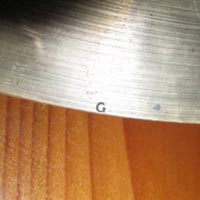 |
Little G on the Edge Many old K Zildjian cymbals from Istanbul are marked with a small letter “G” toward the edge on the underside. This marking indicates that the cymbal was distributed by the Gretsch Drum Company. |
This website contains several embedded discussions of specific cymbal timelines, beyond this introductory front page. Visitors are welcome to post comments, though they are reviewed for quality and relevance. Comments purely aimed at pricing random cymbals will generally not be approved unless contributes to the discussion of cymbal dating practices.
I purchased some vintage cymbals on ebay. they have a crescent and star of David stamp and are signed Kilimauy- Kilimary- ?? or something like that with the word Constantinople underneath it looks as if they are early 20’s. they come on Wednesday any ideas?
If a sound of a cymbal is good, then its a good cymbal. How do they sound?
These are not K Zildjians from Constantinople. They are an imitation type, made in Germany. The second photo shows a “GERMANY” stamp. The star and moon used in Islam does not generally include a six-pointed star, including on all the old K Zildjians, which are from Turkey.
The Kilamauy is some sort of play on K Zildjian which was signed underneath the bells of cymbals of some of the first stamped cymbals from when the town of Istanbul was still known as Constantinople.
But the question of value is still: how do they sound?
Hey everyone! Hoping to post pics of some great cymbals I recently acquired. Please let me know how to do that! Thanks.
Hi. Rob Scott here. To all the commenters out there: when anyone posts a comment, I get an email alert. After that, I can email you for digital photos. Here are some interesting photos from Chris (previous commenter, just above). The first is from a 1970s A Zildjian made from B8 Bronze (92% copper) which appears especially red because it has extra copper in it. The cymbal can be dated to the 1970s because the “three dots” are missing from the stamp (only occurred in 1950s and 1970s) and the first B8 cymbals were introduced in the 1965 by Paiste.
These Zilcos were a less expensive product of the A Zildjian company sold in the 1930s. They came in 9″ 10″ 11″ and 12″ according to a Premier drum catalog from 1937. See: Pinksterboer, Hugo. (1992.) The Cymbal Book. Hal Leonard: Milwaukee, p. 150. I think these two photos represent the earlier and later Zilco stamps from the 1930s. There were Zilcos from 1968-1970, and 1976-1979 that were stamped “Zilco by Azco” which were produced by the A Zildjian company in Canada. Again, these were lower quality and less expensive than Zildjian cymbals.
During the 1940s, the A Zildjian company produced Alejian cymbals for Slingerland (Pinksterboer, 1992).